|
|
Post by MaidenOz on Sept 27, 2007 14:30:11 GMT 10
 FEAR OF THE PORK!! FUK YEAHHHHH!!!!  |
|
|
|
Post by skrabsta on Sept 27, 2007 16:26:59 GMT 10
Fear of the Pork shirts could be ordered at the same time if anyone is interested.
|
|
|
|
Post by downunder on Sept 27, 2007 17:36:21 GMT 10
That's bloody awesome!!
Iwant a couple of those.
|
|
|
|
Post by stormster on Sept 27, 2007 17:38:41 GMT 10
That's bloody awesome!! Iwant a couple of those. Make sure u vote in the POLLS section |
|
|
|
Post by Mean Machine on Sept 27, 2007 17:42:34 GMT 10
Looks great, nice job. Although is it possible to have the edges faded or perhaps a border around the background image on the back? I think that would look better.
Also, I don't know about everyone else, but i'd like dates on the back if possible.
|
|
|
|
Post by skrabsta on Sept 27, 2007 17:59:59 GMT 10
Looks great, nice job. Although is it possible to have the edges faded or perhaps a border around the background image on the back? I think that would look better. Also, I don't know about everyone else, but i'd like dates on the back if possible. was waiting till dates were 100% finalised - which they are now. Boder on the back shouldnt be too hard - will play around with it tonight. |
|
|
|
Post by skrabsta on Sept 27, 2007 19:10:46 GMT 10
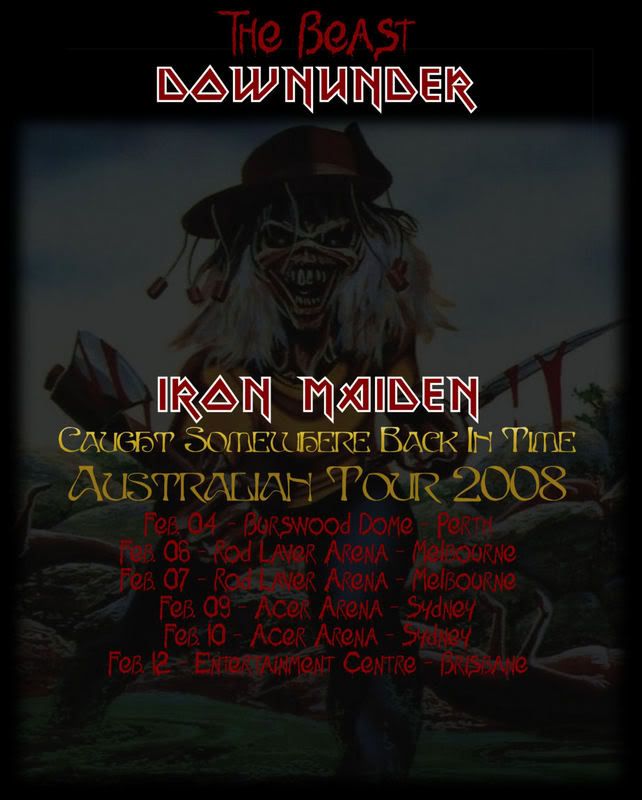
here is the adjusted back  |
|
|
|
Post by Mean Machine on Sept 27, 2007 20:10:40 GMT 10
Yeah, that looks much better, it blends in more. Nice job.
|
|
|
|
Post by stormster on Sept 27, 2007 20:28:34 GMT 10
Maybe make the red a bit brighter? Its abit hard to see on the screen, dunno if it'd be same on the shirt tho!
|
|
|
|
Post by TROOPER71 on Sept 27, 2007 22:07:27 GMT 10
THIS WINS NO NEED TO GO TO POLLS YOURE A F**kING LEGEND SKRABS    |
|
|
|
Post by downunder on Sept 27, 2007 22:23:10 GMT 10
That's bloody awesome!! Iwant a couple of those. Make sure u vote in the POLLS section You are not allowed to vote in this poll. Bollocks. Count that as two |
|
|
|
Post by skrabsta on Sept 27, 2007 23:43:05 GMT 10
Maybe make the red a bit brighter? Its abit hard to see on the screen, dunno if it'd be same on the shirt tho! looks fine on my screen - also - these pics are smaller than what will be used. |
|
|
|
Post by Stephen Thorpe on Sept 28, 2007 21:33:07 GMT 10
I like but can we have all the dates and locations like the first picture.
Would also like to see a different Eddie on the back, but that is just me.
|
|
|
|
Post by skrabsta on Sept 28, 2007 22:29:55 GMT 10
I like but can we have all the dates and locations like the first picture. Would also like to see a different Eddie on the back, but that is just me. firstly - the writing was changed as there were requests for dates to be added. If more people DONT want dates and just locations it can be changed ( changing the writing doesnt take long ) Its a tshirt for an Australian Message Board to be used during an Australian tour - you cant get a picture of Eddie that is any more Australian than that - thats why I picked it. Just out of interest , which picture would you like to see ? If it will look better than what is done I will gladly change it. These arent the finished products and I have no problem making changes so that everyone that wants one is going to be happy. |
|
|
|
Post by Stephen Thorpe on Sept 28, 2007 22:46:52 GMT 10
^Yes I understand all that you said and I wasn't complaining, however I would like to see something else on the back, how about holding a boomarang instead of an axe.
It is just something about the axe and sword, not sure how that is australian.
I also know it isn't finished and I do like it (a lot) but are we still waiting for some other Eddie's?
Not unhappy, just Fussy, but I will buy a couple when we are all still decided.
|
|