|
|
Post by MaidenOz on Sept 13, 2007 1:50:57 GMT 10
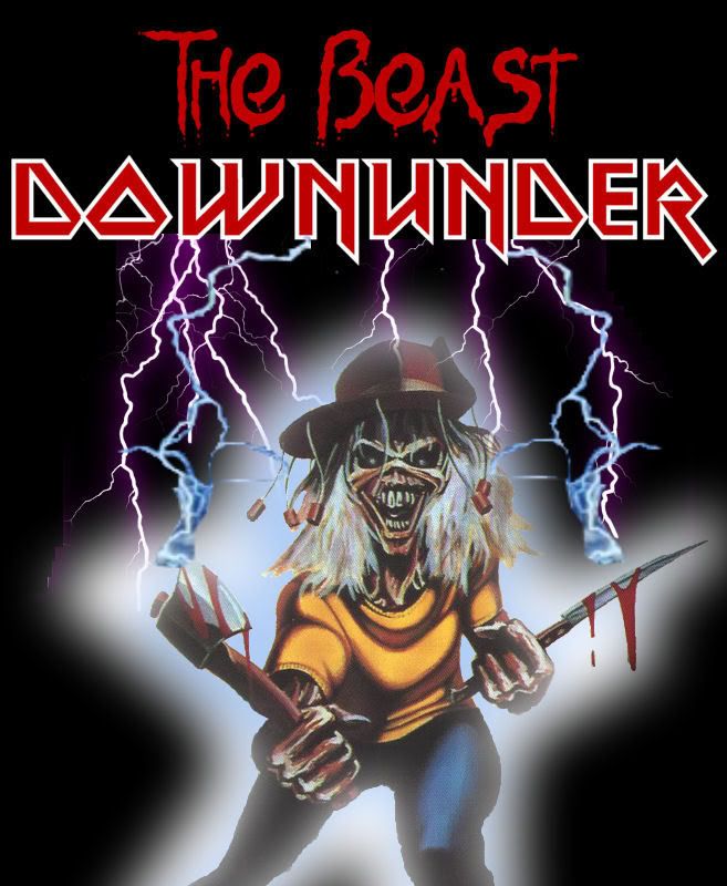
I actually really liked the play on words with the Ausfest idea But oh well  i liked the play on words but think it looked crappy. Have ya found a way to get it lookin a wee bit drippier?  |
|
|
|
Post by Stephen Thorpe on Sept 13, 2007 6:21:05 GMT 10
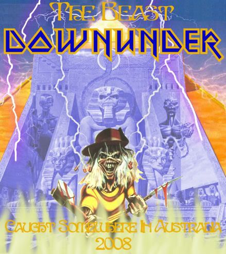
Here's a pic i just found and editted (ever so subtlely  ). The text is pretty much just chucked there to give perspective.  This is the one I like, so busy but very cool. Just need to have a Map of OZ slightly underneath (remove the flaming ground area - where they are standing, if that is what it is?) with the frame opened up a bit. Not sure if it would work but this is what I like. |
|
|
|
Post by skrabsta on Sept 14, 2007 15:04:05 GMT 10
This is by no means a finished picture - just got the idea sort of out before i forgot it. Question is - is this the sort of thing people would like - this one is gonna take a while to do properly and i dont want to waste my time. Just remember - this is just a rough design.  |
|
|
|
Post by MaidenOz on Sept 14, 2007 15:09:46 GMT 10
 I F**kING LOVE IT!!! I F**kING LOVE IT!!! |
|
|
|
Post by Wrathchild on Sept 14, 2007 16:27:44 GMT 10
They are all great but I do like the one with Eddie jumping through Oz.  Perhaps run a poll skrabs? |
|
|
|
Post by skrabsta on Sept 15, 2007 0:47:46 GMT 10
the colours are off - but you get the idea -  |
|
|
|
Post by Stephen Thorpe on Sept 15, 2007 7:09:05 GMT 10
^Nice!!
Is it possible to get a map of OZ under the one I posted 5 people ago, the Storming Australia.
Put the Map on a slight angle and move the main image up a bit. I wish i knew how to do it. Going to try to get a mate to help except he has been sick for a while.
|
|
|
|
Post by akalilith on Sept 15, 2007 15:15:13 GMT 10
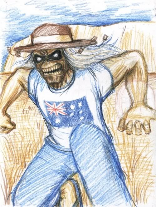
Hey!! I just got around to do some Eddie sketchs this morning, mind you that I'm utter crap as sketching (that's why I've never let anyone see my work in progress while I worked on my portraits) so hopefully you guys still can get the idea;  Please let me know what you think.   **Do you still want Sharon's head on Eddie's hand or you want something else instead (A coala doll? a football?, a can of beer?  ) Please feel free to add the idea. I pretty much worked based on the ideas I gathered from this thread anyway. ;D |
|
|
|
Post by Wrathchild on Sept 15, 2007 15:34:28 GMT 10
You just did them this morning  Your quite a talent, I like them they are great not sure for on a tee shirt unless your going to add some writing etc well done 
|
|
|
|
Post by akalilith on Sept 15, 2007 15:43:50 GMT 10
You just did them this morning  Your quite a talent, I like them they are great not sure for on a tee shirt unless your going to add some writing etc well done  Thanks.. But if people ok with the ideas I can only finish the drawings. I'll need someone to do the rest (adding texts.etc) cos I don't know how to do computer graphic..  |
|
|
|
Post by crossy on Sept 15, 2007 15:47:09 GMT 10
Skrabs why don't you get www.beastdownunder.com? Its available and might only cost you $10 a year? I find it hard to remember the domain name. You should do it if you want the address on a t! www.godaddy.com/ |
|
|
|
Post by ironbrother on Sept 15, 2007 16:50:41 GMT 10
Wow akalilith, they are looking great.. if t-shirts were cheaper to print singularly, i'd take them as is on either side of a white shirt... Very cool! As for developing the design...I don't think it really needs anything in the hands, the aussie flag/map of australia is plenty i think. Oh and the corks + akubra doesn't hurt. So really i can't think how to improve the design!  haha, sorry!! Great talent there! |
|
|
|
Post by Stephen Thorpe on Sept 15, 2007 16:58:10 GMT 10
Very nice sketchs there akalilith.
Love your work, both of them can not decide.
|
|
|
|
Post by akalilith on Sept 15, 2007 17:18:41 GMT 10
Wow akalilith, they are looking great.. if t-shirts were cheaper to print singularly, i'd take them as is on either side of a white shirt... Very cool! As for developing the design...I don't think it really needs anything in the hands, the aussie flag/map of australia is plenty i think. Oh and the corks + akubra doesn't hurt. So really i can't think how to improve the design!  haha, sorry!! Great talent there! Thanks!  Actually the 2nd design I drew Eddie's hands to be customised to hold something..But I think they look quite ok without holdi ng anything.. Again, there're still rooms for improvement..  |
|
|
|
Post by akalilith on Sept 15, 2007 17:21:39 GMT 10
Very nice sketchs there akalilith. Love your work, both of them can not decide. Thanks.. Actually the first design I drew it with your suggestion in my mind (the hold in the shape of aussie map  ) |
|